
Restoring user control in Blood Donation Tracking
Unsolicited Redesign: BlooDoChallenge
Project Overview
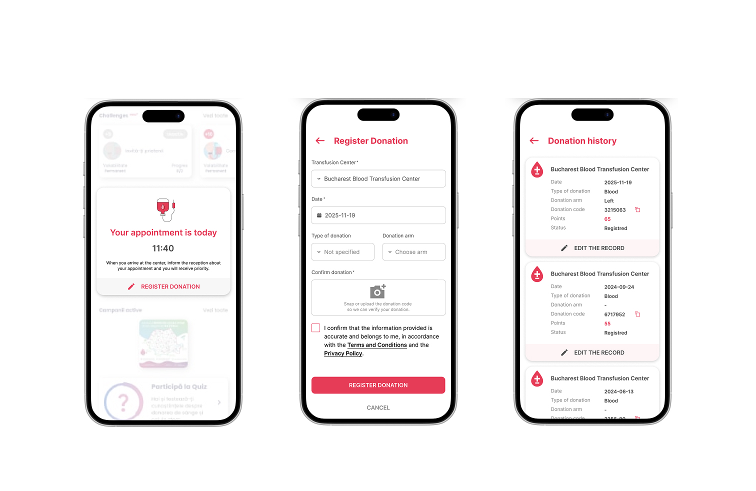
A speculative redesign of the BlooDoChallenge mobile app, focused on fixing a critical usability flaw: users couldn’t edit or delete incorrect blood donation records, leading to a 90-day penalty for simple data entry errors. The goal was to reintroduce User Control and Freedom (UX Heuristic #3) while aligning the UI with modern design standards.
About BlooDoChallenge
A mobile app designed to:
- Raise awareness for blood donation in Romania.
- Help users track their donation history.
- Facilitate scheduling future appointments.
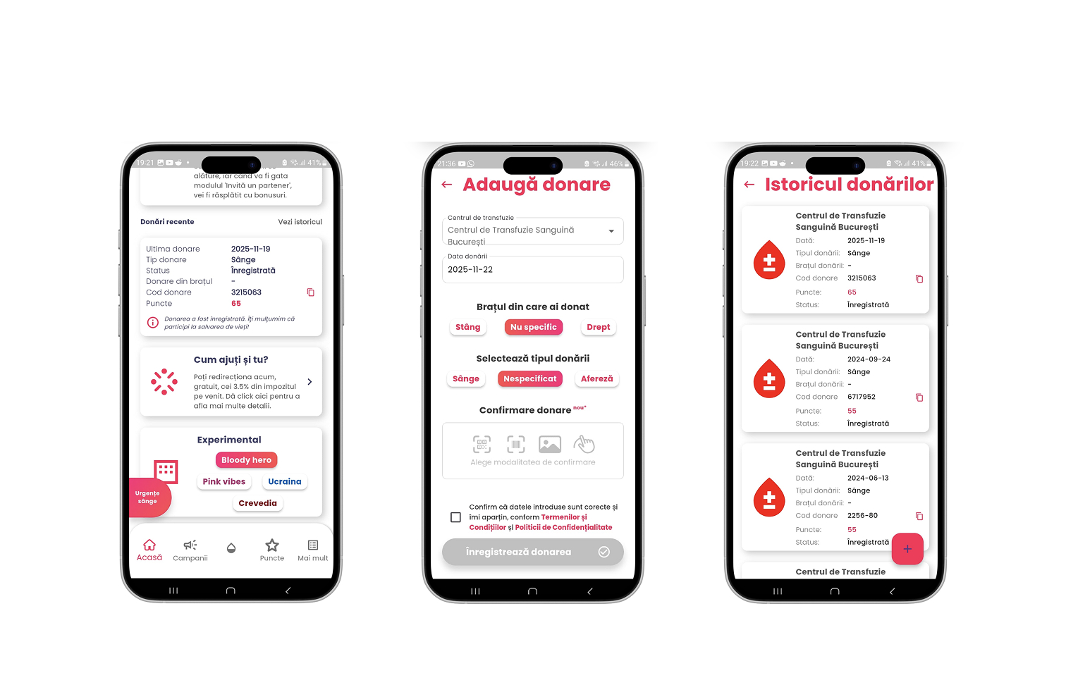
The Problem
A missing "Edit/Delete" function for donation records forces users into a 90-day lockout if they enter a wrong date—penalizing goodwill actions (donating blood) due to a minor system flaw.
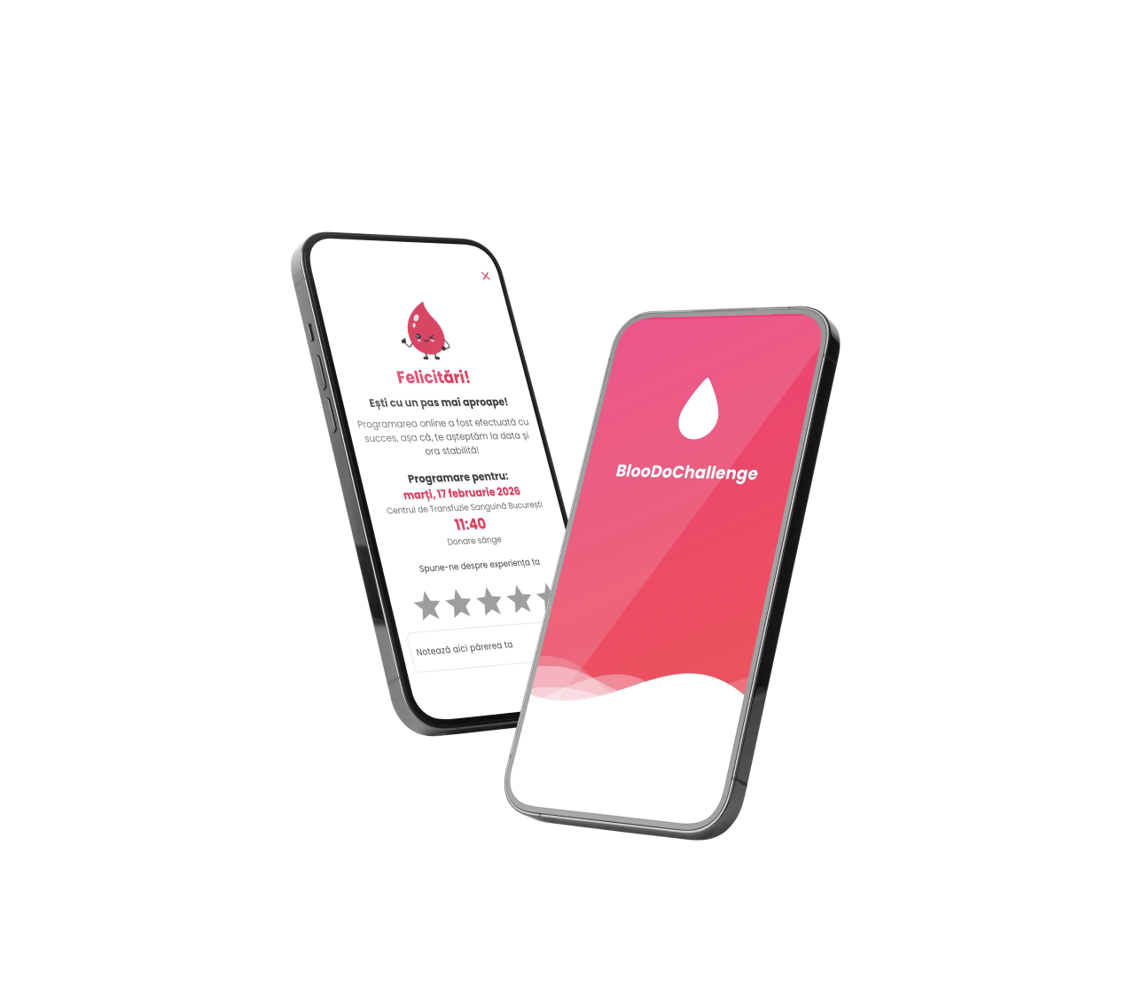
Screenshots from the original BlooDoChallenge app
My role
Unsolicited Product Designer
- Defined a realistic persona (Anca, 34, Product Designer) to anchor design decisions.
- Identified critical pain points through heuristic analysis (focus: User Control and Freedom).
- Designed a "To-Be" user flow for error correction and data management.
- Created high-fidelity mockups for the updated Donation Details screen.
- Analyzed design decisions against UX best practices and articulated key insights.
The Challenge
How might we give users back control over their donation data, without compromising the app’s core functionality?
Key issue
- No error forgiveness: Incorrect date entries trigger a 90-day penalty.
- Lack of basic functionalities: Missing Edit/Delete options violate fundamental UX principles.
- Poor information hierarchy: Unclear homepage content adds to user frustration.
THE PROCESS
Problem Identification
- Mapped the "As-Is" flow (Homepage → Register Donation → Donation History → No Edit/Delete).
- Highlighted the critical failure point: accidental date errors lock users out for 90 days.
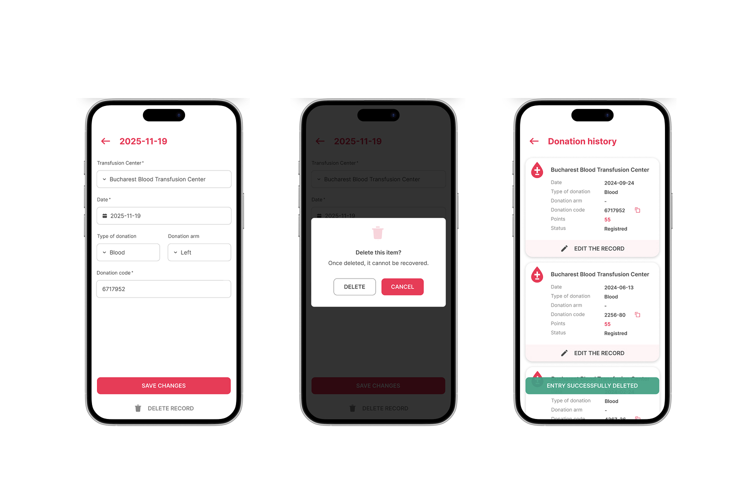
Proposed Solution
- Core Functionality: Added Edit/Delete actions on the Donation Details screen.
- Visual Refinements: improved visual hierarchy (font sizes, spacing, iconography) & aligned UI with modern design standards (clarity, consistency).
- User Flow: Homepage → Register Donation → Donation History → Edit Record → Confirmation.
Validation
- Tested the new flow against UX heuristics (User Control, Error Prevention, Flexibility).
- Ensured the solution respects the 90-day medical rule while allowing error correction.
The redesigned version introduces Edit/Delete functionalities, a cleaner visual hierarchy, and a user-friendly flow. Users can now correct mistakes instantly, without facing the 90-day penalty. The updated UI aligns with modern design standards while prioritizing user control and clarity.
Outcome
- Restored User Control: Users can now edit or delete incorrect donation records.
- Reduced Frustration: Eliminates the 90-day penalty for data entry mistakes.
- Modernized UI: Cleaner visual hierarchy and intuitive interactions.
- Academic Insight: Demonstrated how small UX fixes can remove major barriers to positive user actions (e.g., blood donation).
Key takeaways
- Prioritize User Control. Never lock users out of their own data. Edit/Delete functions are non-negotiable for trust.
- Impact of Missing Basics. A single missing feature (e.g., "Delete") can break the entire user journey.
- Design for Forgiveness. When errors have severe consequences (e.g., 90-day blocks), the system must allow recovery.
- Heuristics in Action. Applied User Control and Freedom (Heuristic #3) to solve a real-world problem.
User flow & Persona
Prototype flow showing the new Edit/Delete path and error recovery
Good design isn’t just about adding features, it’s about fixing the broken ones. This project proved that even small UX interventions can restore trust and empower users to do good.
Disclaimer (Unsolicited Case Study)
This is an unsolicited UX case study created for academic purposes (BYOL, Figma Essentials Class – Final Project). I am not affiliated with or endorsed by BlooDoChallenge. All proposals are based on personal analysis and UX heuristics, not internal data.
AI Assistance: Used for structuring, phrasing, and justifying UX principles.
Core design decisions (flows, mockups, interactions) are original work.
Assets: Icons/typography used under open-source licenses.
Final UI/flows are original creations.


Restoring user control in Blood Donation Tracking
Unsolicited Redesign: BlooDoChallenge
Project Overview
A speculative redesign of the BlooDoChallenge mobile app, focused on fixing a critical usability flaw: users couldn’t edit or delete incorrect blood donation records, leading to a 90-day penalty for simple data entry errors. The goal was to reintroduce User Control and Freedom (UX Heuristic #3) while aligning the UI with modern design standards.
About BlooDoChallenge
A mobile app designed to:
- Raise awareness for blood donation in Romania.
- Help users track their donation history.
- Facilitate scheduling future appointments.
The Problem
A missing "Edit/Delete" function for donation records forces users into a 90-day lockout if they enter a wrong date—penalizing goodwill actions (donating blood) due to a minor system flaw.
Screenshots from the original BlooDoChallenge app
My role
Unsolicited Product Designer
- Defined a realistic persona (Anca, 34, Product Designer) to anchor design decisions.
- Identified critical pain points through heuristic analysis (focus: User Control and Freedom).
- Designed a "To-Be" user flow for error correction and data management.
- Created high-fidelity mockups for the updated Donation Details screen.
- Analyzed design decisions against UX best practices and articulated key insights.
The Challenge
How might we give users back control over their donation data, without compromising the app’s core functionality?
Key issue
- No error forgiveness: Incorrect date entries trigger a 90-day penalty.
- Lack of basic functionalities: Missing Edit/Delete options violate fundamental UX principles.
- Poor information hierarchy: Unclear homepage content adds to user frustration.
THE PROCESS
Problem Identification
- Mapped the "As-Is" flow (Homepage → Register Donation → Donation History → No Edit/Delete).
- Highlighted the critical failure point: accidental date errors lock users out for 90 days.
Proposed Solution
- Core Functionality: Added Edit/Delete actions on the Donation Details screen.
- Visual Refinements: improved visual hierarchy (font sizes, spacing, iconography) & aligned UI with modern design standards (clarity, consistency).
- User Flow: Homepage → Register Donation → Donation History → Edit Record → Confirmation.
Validation
- Tested the new flow against UX heuristics (User Control, Error Prevention, Flexibility).
- Ensured the solution respects the 90-day medical rule while allowing error correction.
The redesigned version introduces Edit/Delete functionalities, a cleaner visual hierarchy, and a user-friendly flow. Users can now correct mistakes instantly, without facing the 90-day penalty. The updated UI aligns with modern design standards while prioritizing user control and clarity.
Outcome
- Restored User Control: Users can now edit or delete incorrect donation records.
- Reduced Frustration: Eliminates the 90-day penalty for data entry mistakes.
- Modernized UI: Cleaner visual hierarchy and intuitive interactions.
- Academic Insight: Demonstrated how small UX fixes can remove major barriers to positive user actions (e.g., blood donation).
Key takeaways
- Prioritize User Control. Never lock users out of their own data. Edit/Delete functions are non-negotiable for trust.
- Impact of Missing Basics. A single missing feature (e.g., "Delete") can break the entire user journey.
- Design for Forgiveness. When errors have severe consequences (e.g., 90-day blocks), the system must allow recovery.
- Heuristics in Action. Applied User Control and Freedom (Heuristic #3) to solve a real-world problem.
User flow & Persona
Prototype flow showing the new Edit/Delete path and error recovery
Good design isn’t just about adding features, it’s about fixing the broken ones. This project proved that even small UX interventions can restore trust and empower users to do good.
Disclaimer (Unsolicited Case Study)
This is an unsolicited UX case study created for academic purposes (BYOL, Figma Essentials Class – Final Project). I am not affiliated with or endorsed by BlooDoChallenge. All proposals are based on personal analysis and UX heuristics, not internal data.
AI Assistance: Used for structuring, phrasing, and justifying UX principles.
Core design decisions (flows, mockups, interactions) are original work.
Assets: Icons/typography used under open-source licenses.
Final UI/flows are original creations.